Overview
📘 This section is only relevant for payment pages.
- If you are implementing From Pricing for the first time, you are in the right section! On this page you will find instructions for our new SDK version
- If you have implemented From Pricing previously, please note these are instructions for our newest SDK version.
Legacy Instructions: [LEGACY] Pay Monthly Selectors
Migration Instructions: From Pricing v2 Migration
The Pay Monthly Selector lets customers choose Flex Pay as their payment method during checkout. Drop an <up-from-pricing> component inside your existing payment options and customers instantly see up-to-date monthly pricing - no extra wiring required.
If your site already has payment selectors for different methods, you add Flex Pay as a new option alongside them.
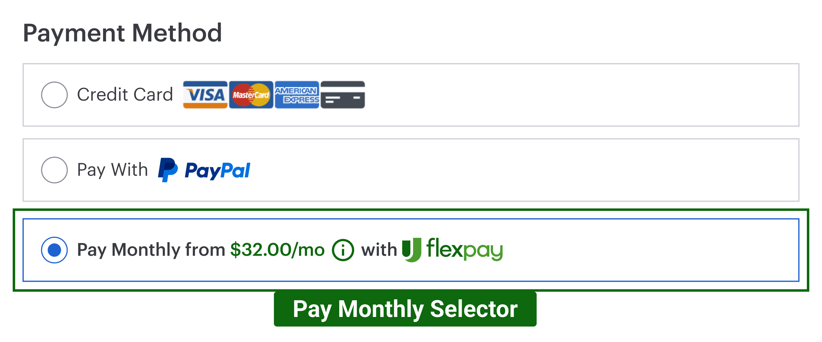
When clicked, the selector activates the Flex Pay iFrame (Step 5) where customers complete their financing application.
Required Elements
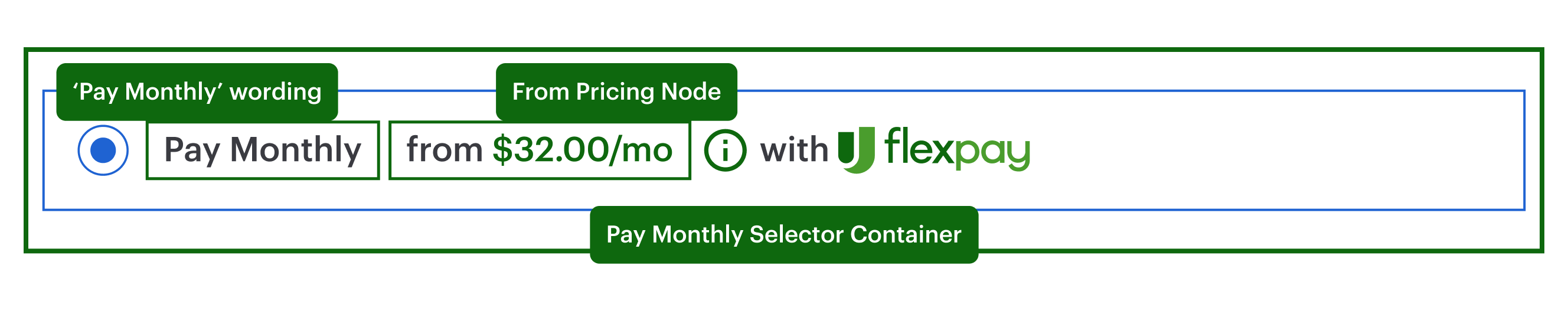
The Pay Monthly Selector is composed of:
- Selector container - wraps the entire option
- "Pay Monthly" label - text identifying the payment method
- From Pricing component - shows the monthly offer amount and handles the error state when an offer is unavailable
Configuration
The Pay Monthly selector is your component - you build it to match your payment page design. The SDK provides the <up-from-pricing> component that goes inside and handles all the pricing logic automatically.
What You Build vs What the SDK Handles
| You Build | SDK Handles |
|---|---|
| Selector layout and styling | Monthly payment calculation |
| Radio button / card selection logic | Offer availability detection |
| Enable/disable states | Error messages and tooltips |
| iFrame activation on selection | Pricing updates when order changes |
Basic Example
Add <up-from-pricing> inside your payment method selector:
<div class="payment-methods">
  <!-- Your existing payment options -->
  <label class="payment-option">
    <input type="radio" name="payment" value="credit-card" checked>
    <span>Credit Card</span>
  </label>

  <!-- Pay Monthly option -->
  <label id="pay-monthly-option" class="payment-option">
    <input type="radio" name="payment" value="pay-monthly" id="pay-monthly-radio">
    <span>Pay Monthly</span>
    <up-from-pricing
      price-value="70000"
      context="pay_monthly_selector"
      show-error="true"
      tooltip-enabled="true"
    ></up-from-pricing>
  </label>
</div>
Key Attributes
| Attribute | Value | Why |
|---|---|---|
price-value |
Same as orderInfo.order_amount |
Ensures pricing matches the checkout total |
context |
"pay_monthly_selector" |
Optimizes layout for selector placement |
show-error |
"true" |
Shows "NOT AVAILABLE" with tooltip instead of hiding |
show-error Behavior
show-error |
Behavior when offer is unavailable |
|---|---|
"true" (recommended) |
Component renders "NOT AVAILABLE" text with an error tooltip showing the reason |
"false" (default) |
Component hides itself completely |
Callback Handler Integration
The callback handler tells you when Pay Monthly is available. Use it to enable or disable your selector:
var payMonthlyOption = document.getElementById("pay-monthly-option");
var payMonthlyRadio = document.getElementById("pay-monthly-radio");

// In your callback handler (Step 4)
OFFER_AVAILABLE: function() {
  // Enable the Pay Monthly option
  payMonthlyRadio.disabled = false;
  payMonthlyOption.classList.remove("disabled");
},

OFFER_UNAVAILABLE: function() {
  // Keep Pay Monthly visible (recommended), but disable selection
  payMonthlyRadio.disabled = true;
  payMonthlyOption.classList.add("disabled");

  // Optional fallback:
  // If your UX requires auto-switching to another method, implement it carefully.
  // Avoid forced focus changes when possible (accessibility).
}
How it works: When the offer is unavailable, the <up-from-pricing> component automatically displays "NOT AVAILABLE" with a tooltip explaining why. You just need to disable the selector so customers can't select it.
Activating the iFrame
When the customer selects Pay Monthly, show the Flex Pay iFrame:
document.getElementById("pay-monthly-radio").addEventListener("change", function() {
  if (this.checked) {
    // Show the iFrame container (see Step 5)
    document.getElementById("up-pay-monthly-container").style.display = "block";
  }
});
See Step 5: Setup Flex Pay iFrame for iFrame configuration.
Styling Guidelines
Style the selector to match your payment page.
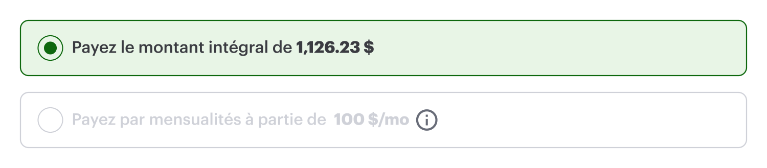
- Offer available - component renders the monthly pricing inside the selector
.png)
- Offer unavailable - component renders error state (when
show-error="true")
.png)
Style the component using CSS Custom Properties:
#pay-monthly-option up-from-pricing {
  --fp-font-size: 14px;
  --fp-price-color: inherit;
}

/* Disabled state styling */
.payment-option.disabled {
  opacity: 0.6;
  cursor: not-allowed;
}
French Translations
The <up-from-pricing> component handles French translations automatically when locale="fr-CA" is set (either globally via init() or per component). This includes both pricing text and error messages.
- Offer Available
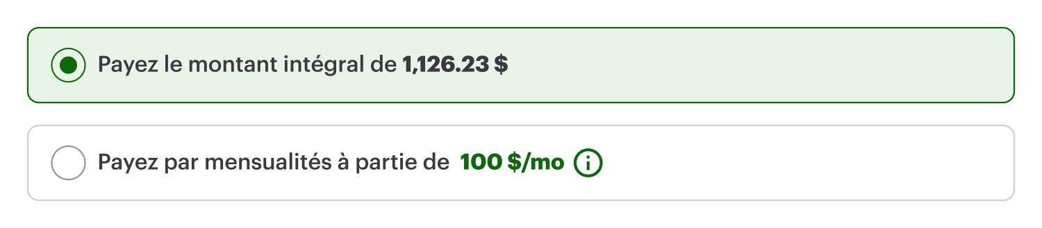
- Offer Unavailable
Step-by-step Validation Guide (Recommended)
This validation applies to payment pages only. Ensure you have completed Steps 1-4 before testing.
- Add the selector HTML to your payment page (see Basic Example above for the full code):
<label id="pay-monthly-option" class="payment-option">
  <input type="radio" name="payment" value="pay-monthly" id="pay-monthly-radio">
  <span>Pay Monthly</span>
  <up-from-pricing
    price-value="70000"
    context="pay_monthly_selector"
    show-error="true"
    tooltip-enabled="true"
    modal-enabled="false"
  ></up-from-pricing>
</label>
- Refresh the page. The selector should show the monthly price:
-
Test the scenarios:
Offer unavailable - Set
orderInfo.order_amountto1000($10.00). The<up-from-pricing>component automatically displays the error state with a tooltip showing the reason.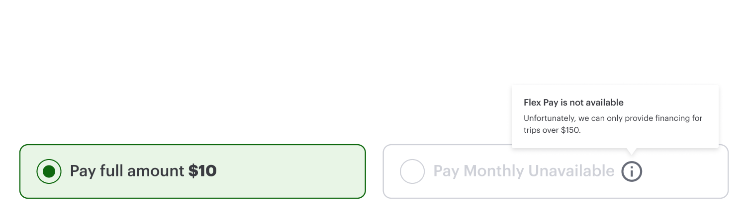
No callback handler changes are needed for the error display - the component handles it.
Offer available - Set
orderInfo.order_amountto70000($700.00). The component renders the monthly pricing and the information modal is accessible.
Next Steps
- From Pricing attributes and styling: From Pricing Configurations
- iFrame setup: Step 5: Setup Flex Pay iFrame